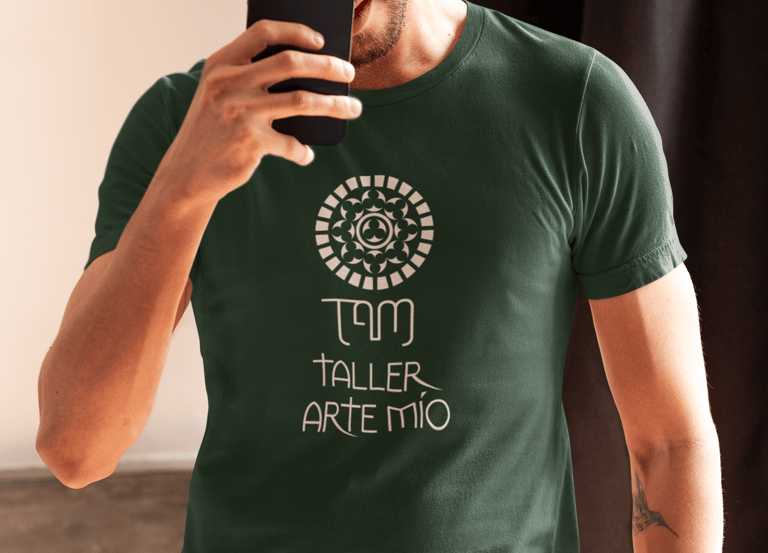
TAM Taller Arte Mío
The brand identity for TAM Arte Mío, a professional restoration studio, was developed to reflect the craftsmanship, precision, and artistic sensitivity inherent to restoration work. The process included the creation of a distinctive logo, the selection of a typographic system that communicates trust and expertise, and the definition of a refined color palette inspired by textures and tones commonly found in catholic religious art restoration.


Color Palette
The color palette was selected to evoke the visual language and material qualities traditionally associated with Catholic religious art. Each tone draws inspiration from the environments, iconography, and historic pigments commonly found in restored liturgical pieces:
#0B0D0C
A deep, near-black tone referencing the shadows, patinas, and aged varnishes present in centuries-old religious artworks. This color conveys solemnity, reverence, and the spiritual depth characteristic of Catholic iconography.#1A301F
A muted green inspired by oxidized metalwork and the natural pigments seen in sacred sculptures and altarpieces. It reflects stability, tradition, and the enduring materials used in ecclesiastical art.#696131
An earthy, antique gold–olive tone reminiscent of weathered gilding, aged wood, and the organic surfaces found in historic retablos. This color reinforces the connection to craftsmanship, preservation, and the passage of time.#BA7633
A warm, rich terracotta-gold tone referencing gold leaf highlights, sacred ornamentation, and the warm hues present in restored icon frames. It introduces a sense of heritage, craftsmanship, and the sacred luminosity often associated with liturgical elements.
Together, these colors form a palette that feels historical yet refined—supporting a visual identity grounded in authenticity, respect for tradition, and the meticulous practice of Catholic religious art restoratio
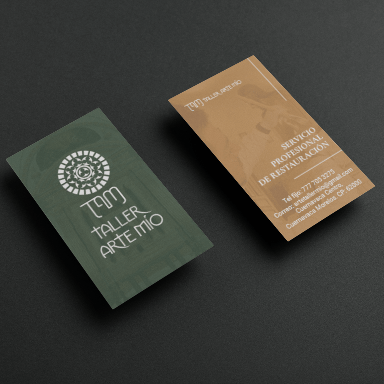
Stationery
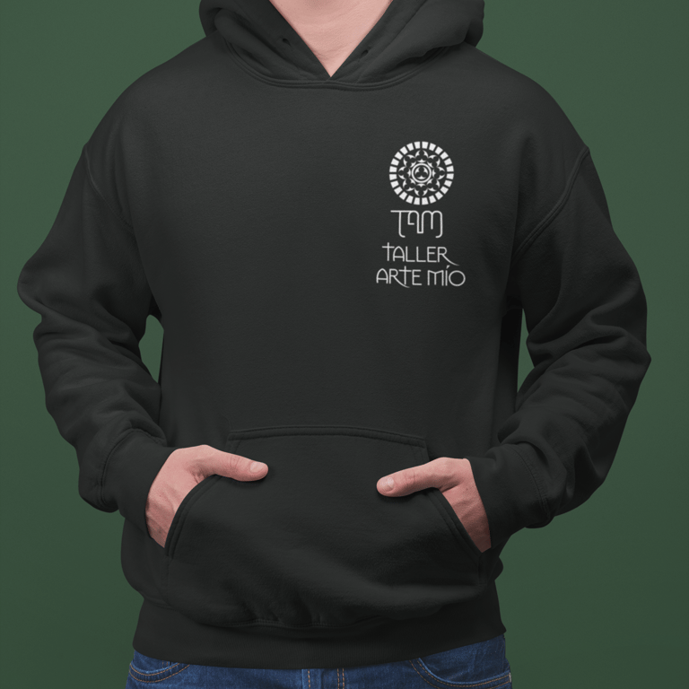
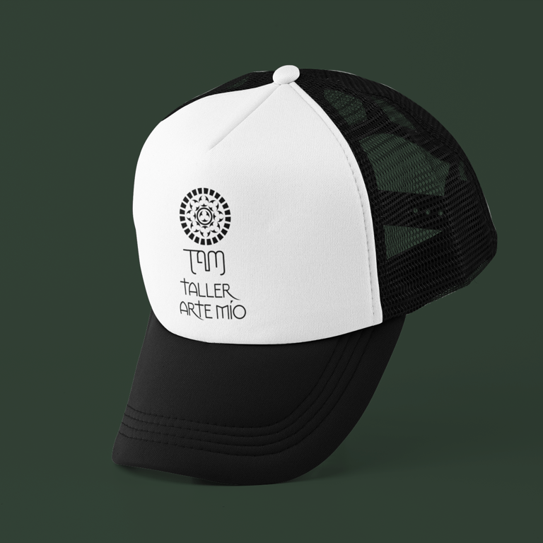
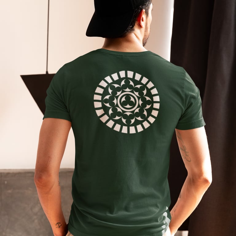
A complete stationery suite—business cards, uniforms, and additional branded materials—was also designed to ensure consistency across all touchpoints. The resulting identity achieves a balance of elegance and functionality, positioning the studio as a meticulous, credible, and artistically focused provider in the preservation of cultural and personal heritage.
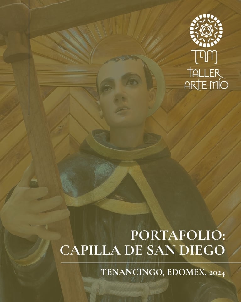
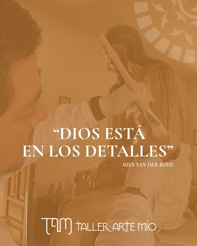
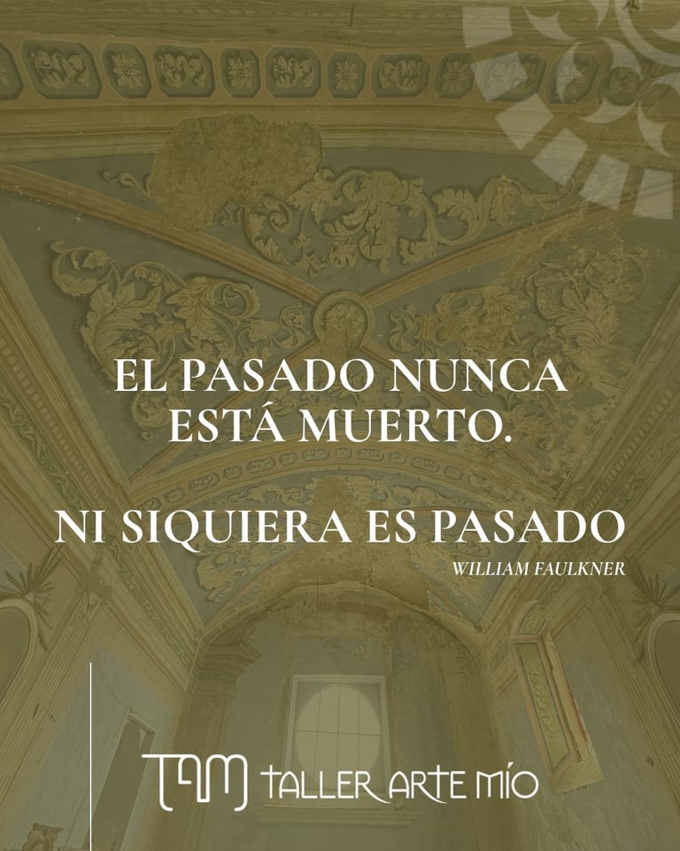
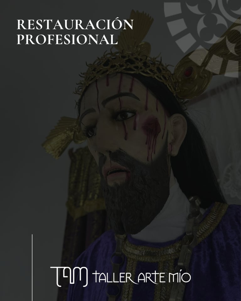
Social Media Templates
A series of social media templates was designed to extend the brand’s visual identity across digital platforms. The templates apply the full color palette and an elegant, serif-led typographic system to create a refined and historically grounded aesthetic. Clean layouts, balanced spacing, and subtle ornamental accents ensure the content feels aligned with the tradition of Catholic religious art while remaining contemporary and easy to navigate.
Tools
Find out what design softwares I used for this project
Affinity Photo
For photo edition
Canva
For all social media posts.
Affinity Designer
To create the logo and ornaments
All rights reserved Aramara Riquelme